To read Part 1 of this post, click here!
Once we had our sun room unloaded and cleaned, I was a little amazed by how spacious it appeared. I didn’t want to lose that feeling as we put the room back together, so I tried to make choices that preserved its openness.
Paint
When we decided to refresh our sun room, Mike and I knew we’d have to begin by painting. We have, over 30 years of marriage, painted more rooms than I can easily count. Still, this room was a challenge like no other.
We’d debated the color of this room for years, and still–when the moment arrived–we couldn’t decide what to do. Did we want something dramatic? Something playful? A contrasting trim color that would call attention to the beautiful windows that look out on our back yard? Or something neutral–something that would last for years and allow us to switch up the details whenever we wanted? We weren’t even sure whether to use interior or exterior paint, given the nature of the walls.
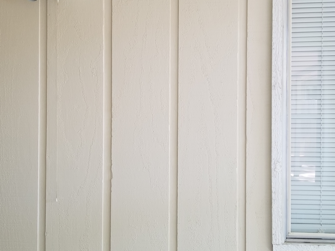
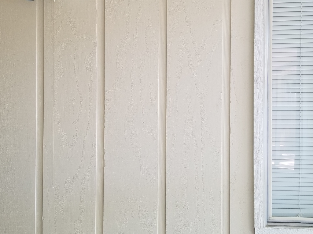
Ultimately, we decided to treat the room as an interior space and hope for the best. We chose “Maison Blanche” from Sherwin Williams for the walls and “Extra White” for the trim.
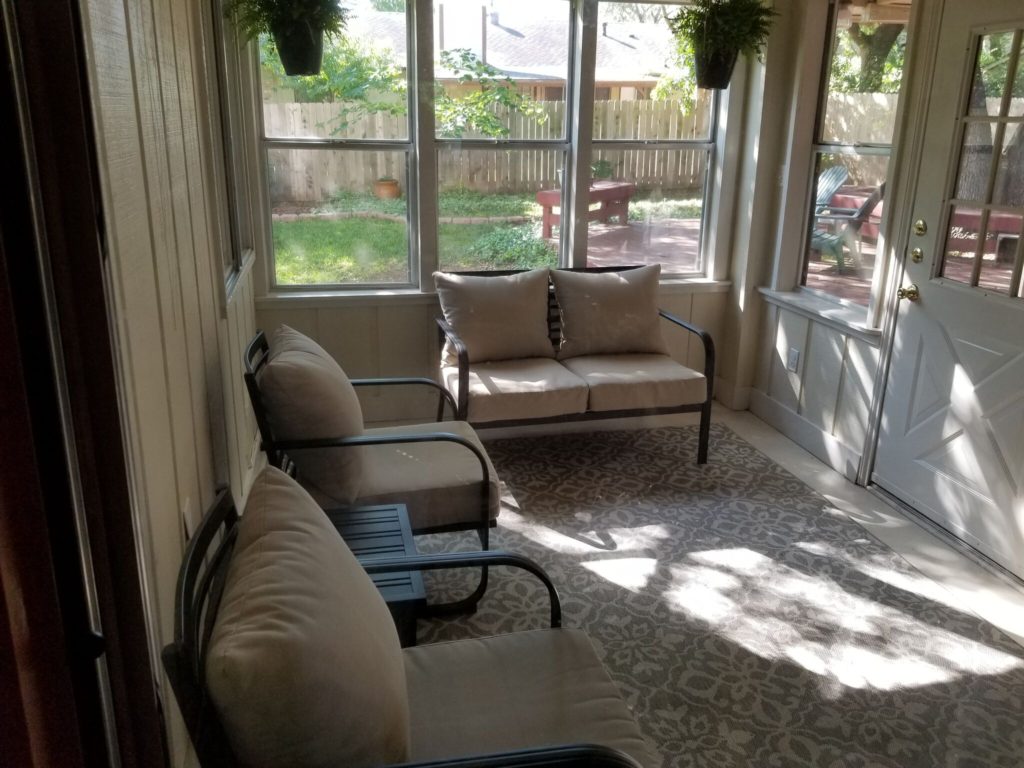
We’d used this same color combination in our master bathroom and bedroom, so we knew we liked it. We also knew how “Maison Blanche” works in varying light. This room gets a lot of sun in the morning, and in that light (pictured here) the walls look creamy. In the afternoon–when the sun has moved to the other side of the house, they’re a very light tan. I like this shade because it’s a warm neutral without reverting to1970’s-beige. That was the one color I absolutely wanted to avoid.
Fixtures
We also decided to switch out the light covers in our ceiling fan. That was something we hadn’t really thought about doing, but once we started cleaning the room, it was clear those globes needed a good wash. (You can just barely see them at the top of the “before” photos of this room.) They were ruffled and scrolled–what Mike describes as “Scarlet O’Hara globes”–and covered with crevices that really did nothing but accumulate dust.
Once we had them down, Mike said “Why are we going to put these ugly things back up?”
It was a good question.
So I went on Amazon and ordered these light covers with a rough linen finish. They seemed in keeping with the general tone of the room.
I would have loved to replace the ugly fake-gold ceiling fan, but it still does its job, so it’s not going anywhere for now. And, for roughly $30, these new light fixtures made a huge difference in the appearance of the room.
Plants
We gave a lot of thought to whether or not we’d add greenery to the sun room. Given my way with things, I would have the whole space filled with plants. But we share our home with two dogs and two cats, all of whom have access to this room. I knew the cats would nibble on anything I put at their level; I knew it was likely the dirt in any large potted plant would become a litter box. I also knew the dogs might decide to mark large plants as their own. Same goes for silk plants–which, for the most part, I just don’t like.
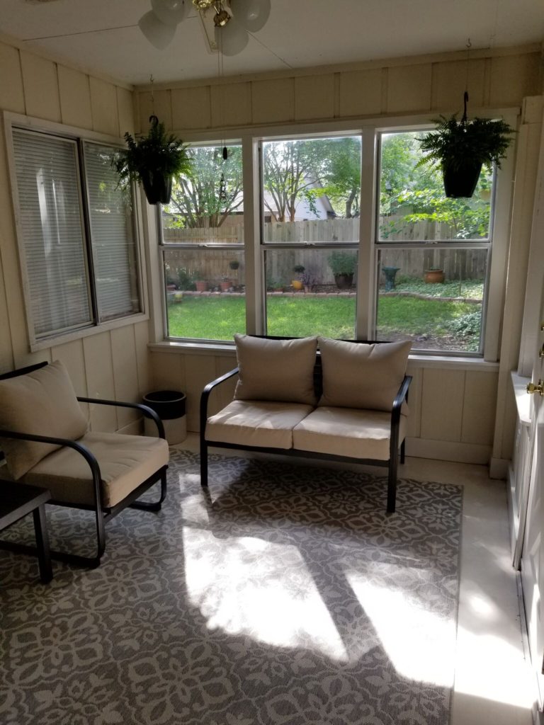
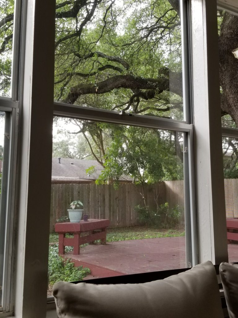
So, to avoid all that drama, I bought two Boston ferns in hanging pots. I didn’t want them to block the light, so I had Mike position them in the corners of the windows. For now, I’m content to have a little indoor greenery framing my view of the great outdoors.
Furniture
When we took out the built-in desk in this room, we purchased a nice set of indoor/outdoor furniture to fill the space. That furniture didn’t need to be replaced, but I’d never been entirely happy with the way it looked in this room, no matter how we arranged it.
But as we were thinking about how to place the pieces, it occurred to me: We didn’t have to use them all. For some reason, it wasn’t until we had all five pieces of furniture out of the room that I realized we didn’t have to bring them all back in. Maybe too much furniture was part of the problem.
We wanted to retain as much seating area as possible, so we left the large coffee table on our back patio. We positioned the settee in front of the windows, to anchor that end of the room, and the two rocking chairs under the mounted lights on the north wall. (We’ve agreed this will be a “no-tech” space in our house, so having good light for reading is important.) A small square table sits between the two chairs. The large crock that holds Millie’s toys now sits out the way, in a corner.
We though about replacing the gray indoor/outdoor rug with something brighter, but after giving it a good scrub with the garden hose, it looked brand new–so we kept it. We aligned the rug with the northwest corner of the room, rather than centering it in the space, to hide the brown carpet squares underneath. The white border around the visible edges actually makes the room look larger.
Final Touches
The walls of this room are still bare, for the most part. Mike and I have decided not to be in a hurry, in terms of wall decor– when we find something we like, we’ll find a place for it. Until then, though, I’m happy to let the colors of our back yard be our primary source of decoration.
For a small-budget refresh, I think we did a pretty good job of making this room a place where we can find a cozy moment of peace and quiet.









No Comments